Fossilpunk:
Turn-Based 4X Tactical HUD and System Architecture
Role
Lead Product Designer (HUD Architecture, Interaction Systems & Design Standardization)
Scope:
Viewport Ergonomics, Information Hierarchy, Lexical Standardization, Progressive Disclosure Systems
Fossilpunk is an indie turn-based 4X strategy game that merges tactical grid movement, base expansion, and roguelite meta-progression. In its early playable builds, the interface suffered from modal sprawl, floating menus that occluded the isometric grid, ambiguous game terminology, and high cognitive load during core turn loops.
By analyzing tactical interaction benchmarks (notably Into the Breach and XCOM 2), I restructured the game’s information architecture into an edge-docked ergonomic framework. This eliminated viewport clutter, introduced progressive disclosure to building workflows, and overhauled the pre-mission briefing loop to build anticipation and strategic clarity.
View Project on SteamBy analyzing tactical interaction benchmarks (notably Into the Breach and XCOM 2), I restructured the game’s information architecture into an edge-docked ergonomic framework. This eliminated viewport clutter, introduced progressive disclosure to building workflows, and overhauled the pre-mission briefing loop to build anticipation and strategic clarity.
Viewport Ergonomics and Edge-Docked Architecture
The Problem
In early playtests, floating menus and modals spawned directly over the center of the screen, obscuring active units and contested tiles. Key system actions, such as the "End Turn" button, relied on abstract standalone icons (a single right-arrow) with no text grounding, causing players to lose track of turn cadence or mistake the button for next-unit cycling.
In early playtests, floating menus and modals spawned directly over the center of the screen, obscuring active units and contested tiles. Key system actions, such as the "End Turn" button, relied on abstract standalone icons (a single right-arrow) with no text grounding, causing players to lose track of turn cadence or mistake the button for next-unit cycling.
The Strategy and Solution
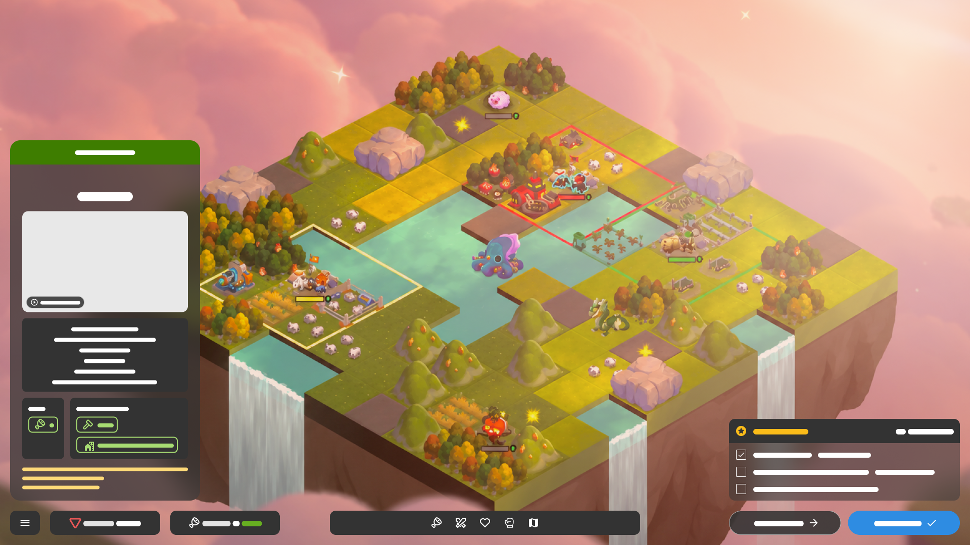
Total Central Grid Focus:All interactive controls were moved out of the active combat field and permanently docked to the viewport edges.
Dedicated Bottom Command Bar:The bottom perimeter serves as the single interaction anchor:
Far Left:Global menu toggle and resource counters (Score, Food (+rate)).
Center:Contextual action/ability bar with clear iconography for unit commands and build limits.
Far Right:Tactical turn execution grouped into a pair: secondary Next Unit → and high-contrast primary End Turn ✓.
Right Perimeter Pacing:The active objective list and mission turn countdown (15 turns left) are pinned cleanly to the lower-right corner, directly above the End Turn CTA to keep strategic goals paired with player commitment.
Total Central Grid Focus:All interactive controls were moved out of the active combat field and permanently docked to the viewport edges.
Dedicated Bottom Command Bar:The bottom perimeter serves as the single interaction anchor:
Far Left:Global menu toggle and resource counters (Score, Food (+rate)).
Center:Contextual action/ability bar with clear iconography for unit commands and build limits.
Far Right:Tactical turn execution grouped into a pair: secondary Next Unit → and high-contrast primary End Turn ✓.
Right Perimeter Pacing:The active objective list and mission turn countdown (15 turns left) are pinned cleanly to the lower-right corner, directly above the End Turn CTA to keep strategic goals paired with player commitment.

Contextual Action Dock
The ProblemEarly builds presented all town options, unit recruits, and building structures in unsegmented clusters, creating severe visual noise. Players faced cognitive overload when attempting basic tile development, while critical unit stats (movement, attack, defense) competed with base-building mechanics.
The Strategy and SolutionContext-Driven Dock States:The bottom-left dock operates as an adaptive drawer that shifts based on the active selection:
1.Unit Selected:Surfaces unit archetype, health/shield indicators, attack power, movement radius, and action buttons (Commando).2.City/Settlement Selected:Displays settlement tier (Lv. 1 Fortfalls), defensive bonus, garrisoned units, and economic output.
3.Empty Field/Tile:Collapses into a minimal summary with a single explicit primary CTA: Start Building.
Two-Tier Construction Drawer:When initiating a build action, the interface deploys a docked two-tier card drawer:
Tier 1 (Catalog):Vertical grid of available blueprints sorted by cost and category.Tier 2 (Blueprint Inspector):Detailed inspection card displaying cost, terrain prerequisites (field), city construction limits (2 build limits per city), mechanical traits, and an affirmative Build button.
1.Unit Selected:Surfaces unit archetype, health/shield indicators, attack power, movement radius, and action buttons (Commando).2.City/Settlement Selected:Displays settlement tier (Lv. 1 Fortfalls), defensive bonus, garrisoned units, and economic output.
3.Empty Field/Tile:Collapses into a minimal summary with a single explicit primary CTA: Start Building.
Two-Tier Construction Drawer:When initiating a build action, the interface deploys a docked two-tier card drawer:
Tier 1 (Catalog):Vertical grid of available blueprints sorted by cost and category.Tier 2 (Blueprint Inspector):Detailed inspection card displaying cost, terrain prerequisites (field), city construction limits (2 build limits per city), mechanical traits, and an affirmative Build button.

Mission Briefing and Tactical Node UX
The ProblemIn the roguelite campaign map, clicking a mission node generated an unformatted, debug-like text card on the side of the screen. It dumped mission parameters, objectives, and card drops into flat lines of monospace text without visual hierarchy, excitement, or actionable previews.
The Strategy and SolutionBenchmarking Strategic Briefings:The briefing was restructured from a passive text card into an operational briefing drawer. (Note: World map path lines were handled by Art Direction; UX focused entirely on briefing layout, scannability, and ergonomics).
Information Scaffolding:
Top Header & Atmosphere:Location key-art banner (Golden Valleys) paired with glanceable mission metadata: 3-star difficulty rating and standardized tile dimension badge (9x9).Structured Objectives Checklist:Converted raw text into an actionable checklist with checkmark tokens, differentiating primary completion requirements from optional challenges.Loot & Tech Anticipation:Reward pools isolated into collapsible cards with rarity tags and card count icons.Action Footer:Pinned time-limit indicator (15 Turns Limit) resting directly above a full-width primary CTA (Start mission).
Information Scaffolding:
Top Header & Atmosphere:Location key-art banner (Golden Valleys) paired with glanceable mission metadata: 3-star difficulty rating and standardized tile dimension badge (9x9).Structured Objectives Checklist:Converted raw text into an actionable checklist with checkmark tokens, differentiating primary completion requirements from optional challenges.Loot & Tech Anticipation:Reward pools isolated into collapsible cards with rarity tags and card count icons.Action Footer:Pinned time-limit indicator (15 Turns Limit) resting directly above a full-width primary CTA (Start mission).
Pre-Run Architecture: Faction Selection and Meta-Progression
The ProblemIn early builds, players were dropped directly into campaign mission nodes with no initial onboarding gate or archetype setup. There was no mechanism to choose a faction, evaluate starting rosters, or view long-term progression before committing to a run. Unlocks, building rosters, and achievement tracking were completely detached from run initialization, leaving players blind to faction playstyles and mechanical synergies before selecting their first mission path.
The Strategy and SolutionTo bridge high-level meta-progression with tactical runs, I designed a dedicated Pre-Run Initialization Screen that serves as the entry point before entering the campaign map. It introduces a 3-column modular architecture that anchors player identity, loadout preview, and long-term milestones in a single view:
1. Faction Selector (Left Column)
Quick Navigation:High-contrast circular faction badges displaying active, locked, and randomized states.Agency:Allows instant toggling between unlocked factions or triggering a randomized run without navigating submenus.
2. Archetype Identity & Hero Focus (Center Column)
Tactical Preview:Prominently showcases the faction's 3D hero model, thematic credo ("Strength is truth food is law"), and operational lore.Commitment CTA:Anchors an explicit primary action button (Select) at the base of the card to confirm loadout and proceed to the mission route.
3. Dual-State Meta Drawer (Right Column)
Collection State (Default):Provides a visual inventory of faction-specific assets divided into Units and Buildings, using distinct silhouette masking for locked items so players immediately understand their current progression ceiling.Achievements State (Toggleable):Seamlessly swaps the right panel to show sector objectives, turn-count trials, and XP milestones (e.g., "Win in less than 15 turns", "Win with Crestonians") via a single micro-toggle button (Collections > / Achievements >) without displacing the player from the character view.
1. Faction Selector (Left Column)
Quick Navigation:High-contrast circular faction badges displaying active, locked, and randomized states.Agency:Allows instant toggling between unlocked factions or triggering a randomized run without navigating submenus.
2. Archetype Identity & Hero Focus (Center Column)
Tactical Preview:Prominently showcases the faction's 3D hero model, thematic credo ("Strength is truth food is law"), and operational lore.Commitment CTA:Anchors an explicit primary action button (Select) at the base of the card to confirm loadout and proceed to the mission route.
3. Dual-State Meta Drawer (Right Column)
Collection State (Default):Provides a visual inventory of faction-specific assets divided into Units and Buildings, using distinct silhouette masking for locked items so players immediately understand their current progression ceiling.Achievements State (Toggleable):Seamlessly swaps the right panel to show sector objectives, turn-count trials, and XP milestones (e.g., "Win in less than 15 turns", "Win with Crestonians") via a single micro-toggle button (Collections > / Achievements >) without displacing the player from the character view.